 Lots of people make charts that look like spaghetti bowls. I don’t. We like to keep charts SIMPLE here in the Crypto Traders group, because simple charts help us make simple decisions in swing trades (which are trades that take days or weeks to play out.)
I understand the value of RSI, MACD, Fibonacci, and use them sparingly in certain situations, but I think those indicators are little more than guidelines and guesswork combined with a little bit of sorcery and ego!
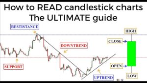
Instead, since I’m only making about 2-3 trades per week, I watch simple support and resistance zones. There are other candle patterns to consider and trend lines to draw, but the most basic thing to watch for is this: where does the price bounce up? And where does the price bounce down?
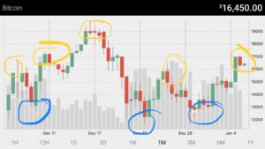
The attached picture is the last month of action on the BTC/USD chart. See how many times the trend changed direction around the same prices? Day traders are using a witch’s brew of indicators trying to buy and sell fifty times a day, while I’m looking at the Bitcoin chart and hammering it with buys around $12.5k and sells around $15.5k – only modifying if the volume tells me to hold out a bit more.
This makes for less stress, less p seudoscience, and very typically: more profit!! It’s so easy, I can chart on my phone.
In short: zoom out, see where the price changed direction before, buy or sell in those zones.
What’s your strategy? What is your system of charting? Are you consistently profitable with it?
Make sure to audit yourself, so you can be sure your systems are actually making you money.
Join the discussion on our official facebook group!


